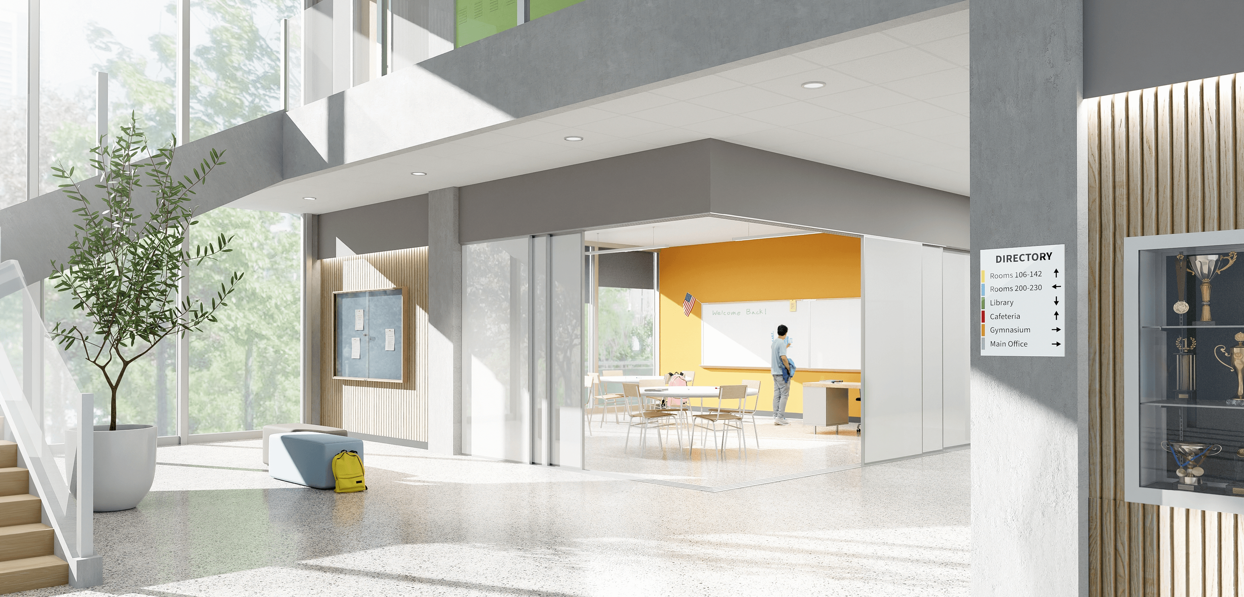
Claridge Brand Refresh
Modernizing a legacy writing-surface brand through identity, digital experience, and product visualization.
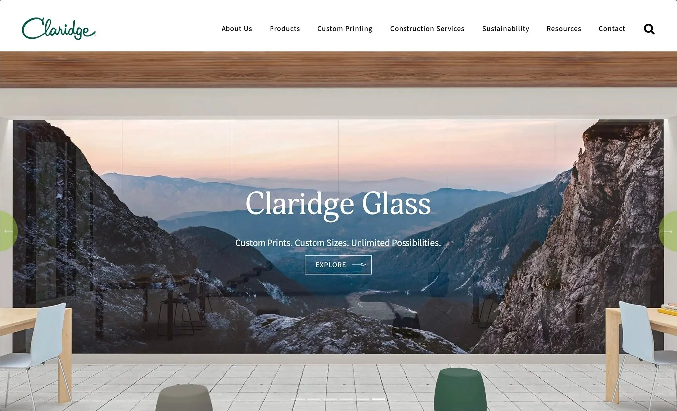
Client: Claridge Products
Role: Creative Manager
Timeline: Six months, launched October 2023
Scope: Brand strategy, creative direction, UX/UI, product visualization, and developer collaboration.
Overview
Claridge had more than 75 years of brand recognition, but its digital presence had evolved piecemeal. Competing colors, inconsistent imagery, and fragmented page structures made the website feel less cohesive and made similar product families difficult to understand.
With a new sister brand entering the company’s portfolio, Claridge also needed a more clearly defined position of its own: established, technical, education-focused, and trusted.
As Creative Manager, I led the six-month refresh from strategy through implementation. Working with the SVP of Marketing, the internal creative team, and development partner Grove Marketing, I created a visual system that modernized Claridge without sacrificing the equity of its recognizable script logo.
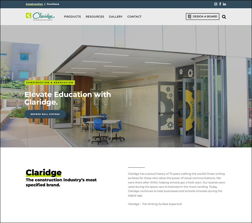
Before
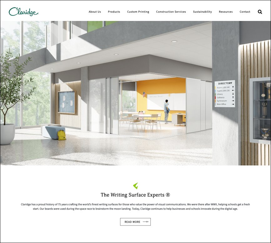
After
The previous website had accumulated competing visual styles and inconsistent page structures. The refresh introduced a more focused identity, unified interface, and clearer product storytelling.
The Challenge
Claridge serves a wide audience—including architects, construction professionals, dealers, school administrators, and facility managers. The website needed to accommodate both visual exploration and detailed product research while ultimately guiding visitors toward the sales team.
The existing experience made that difficult. Product imagery was inconsistent, related products were hard to differentiate, and the interface lacked a unified visual hierarchy.
The refresh focused on three goals:
Preserve Claridge’s established brand recognition.
Make complex product options easier to explore and compare.
Create a scalable system that could extend beyond the website.

Simplifying the Identity
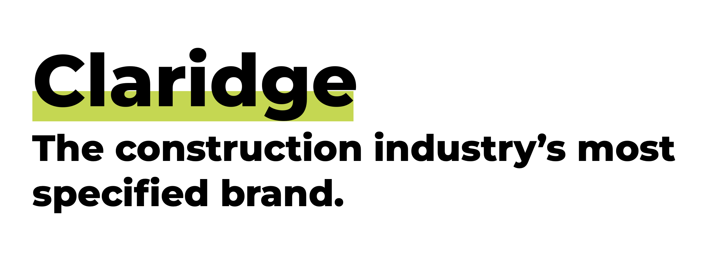
The Claridge script logo already possessed strong recognition, so I preserved it rather than redesigning it. I removed the boomerang symbol and “The Writing Surface Experts” tagline from the primary lockup, allowing the script mark to stand confidently on its own.
The boomerang remained part of the broader identity but became a supporting graphic used selectively rather than appearing in every logo application.

Previous primary lockup: script, boomerang, and tagline

Refreshed primary mark: Claridge script alone

Supporting element: boomerang shown separately
The refresh protected Claridge’s most recognizable asset while creating a more flexible hierarchy for its supporting elements.
Establishing the Visual System
I paired Adonis Web with Source Sans Pro to balance Claridge’s educational heritage with the clarity required for technical product information. I also reduced the primary palette to dark green and lime, creating a more consistent and recognizable foundation across every touchpoint.
Typography

Adonis Web: Headlines and editorial moments

Source Sans Pro: Navigation, specifications, and body copy
Colors
Claridge Green
#255C4F

Claridge Lime
#98C93C

A Technical Visual Language
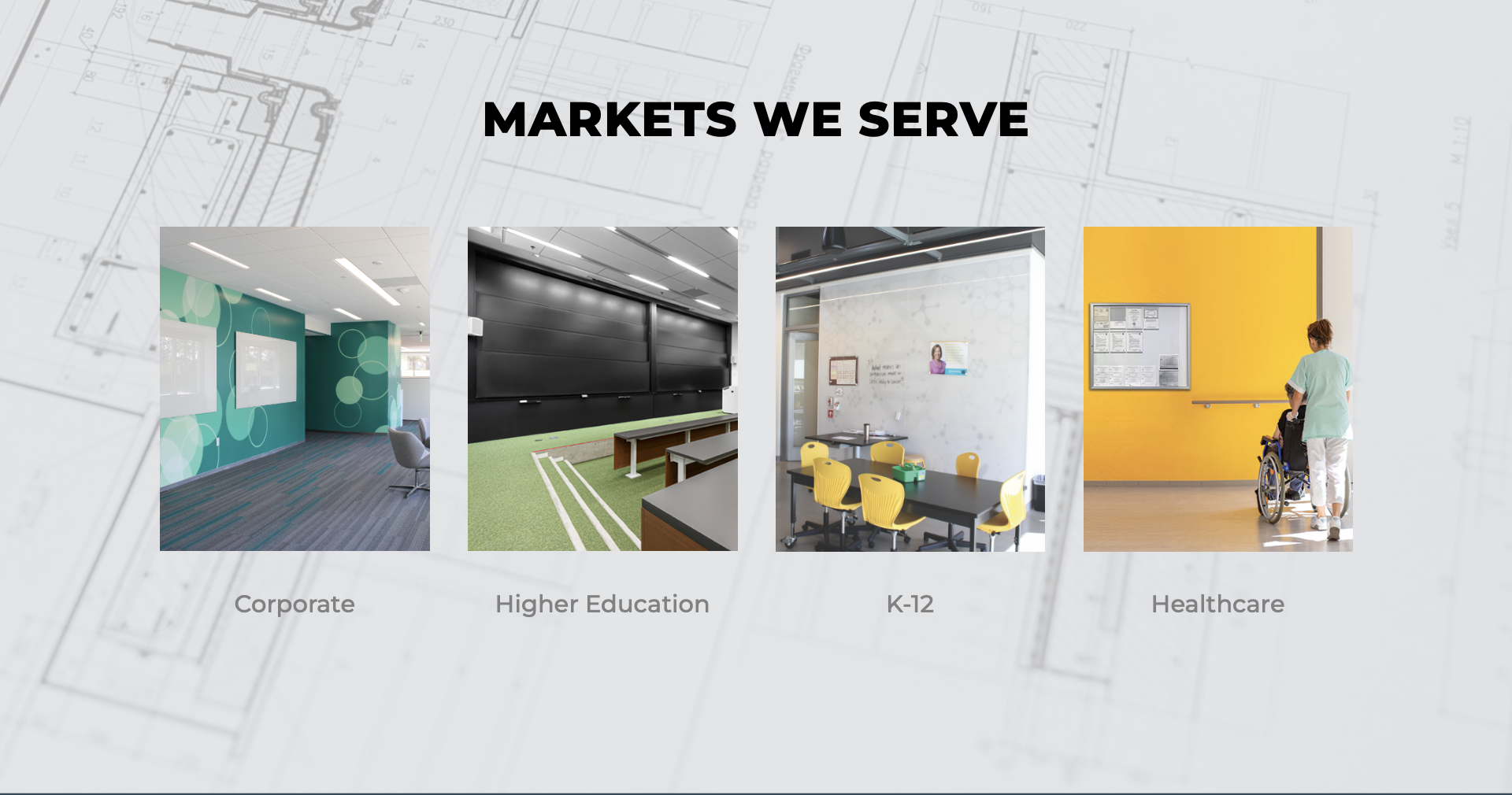
To connect the experience more closely to architecture and construction, I introduced grid structures, sketch-style architectural imagery, technical product illustrations, and interface details inspired by specification drawings.
Button arrows extend toward the edge of their containers on hover, creating a subtle reference to dimension lines and technical callouts. These details made the experience relevant to specifiers without overwhelming less technical audiences.

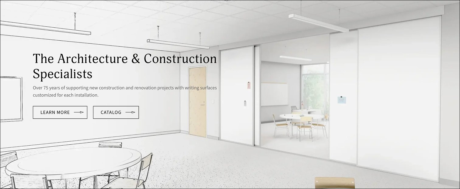
Grids, architectural illustrations, and dimension-inspired interactions connected the interface to Claridge’s construction and specification audience.
Making Similar Products Easier to Understand
Many Claridge boards appear nearly identical from a distance, even though their trim, rails, trays, and construction details vary significantly.
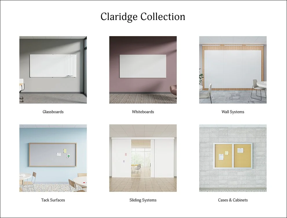
I redesigned the Series Collection to make those differences easier to recognize. Environmental imagery gave each series a distinct visual identity, while hover interactions revealed closer technical views without forcing users to leave the collection page.
Hover states allowed users to move from environmental context to construction detail without interrupting the browsing experience.
Using Color for Differentiation
I assigned cool-toned environments—including blue, lavender, blush, tan, and gray—to individual product series. The colors made visually similar products easier to distinguish while maintaining a cohesive overall presentation.
The environments also gave each product a stronger visual presence than the predominantly white and gray imagery used previously.




Rebuilding the Product Library
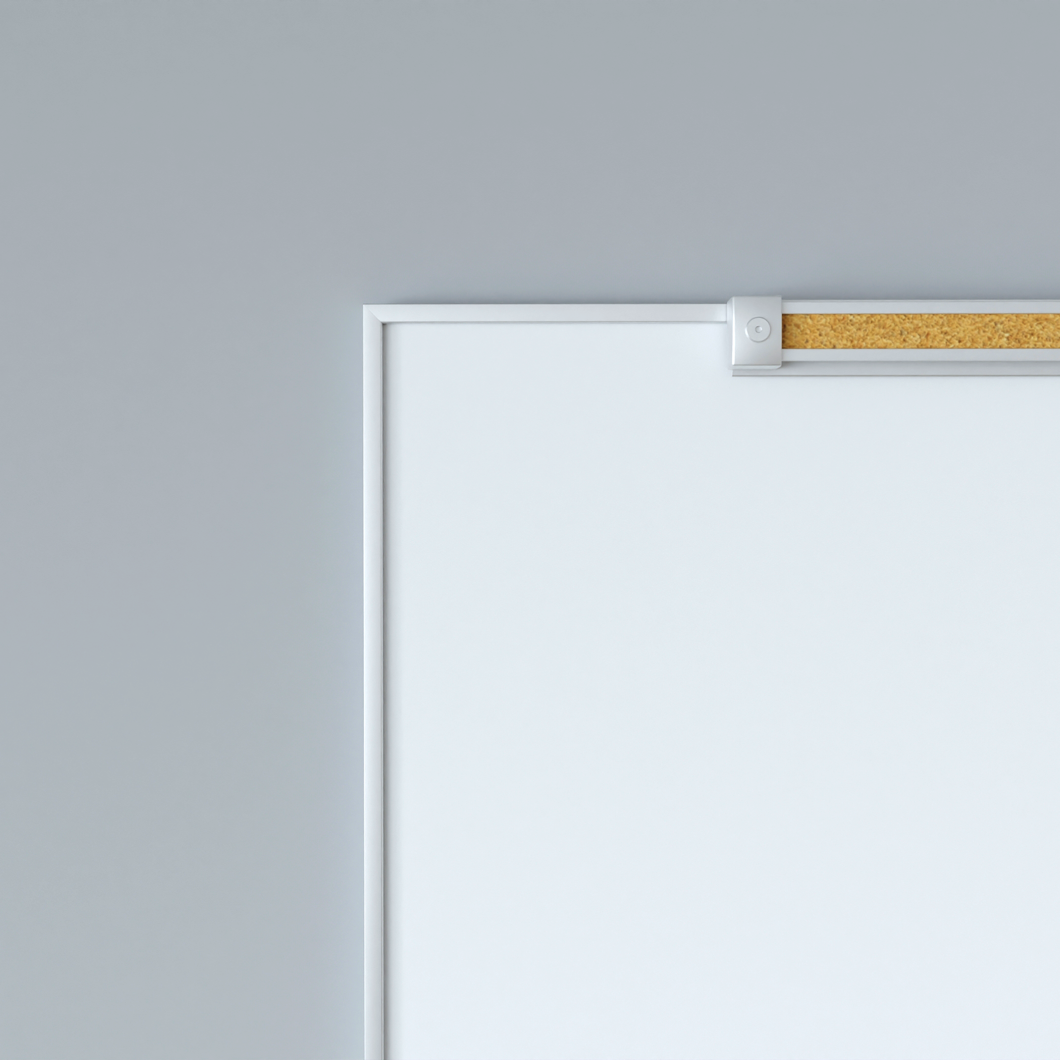
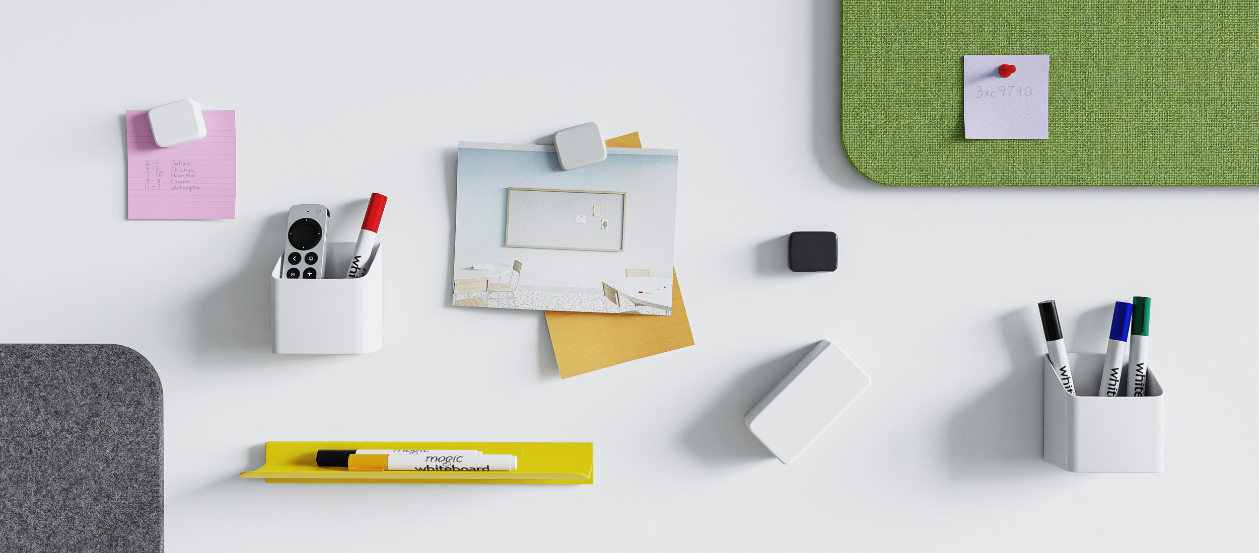
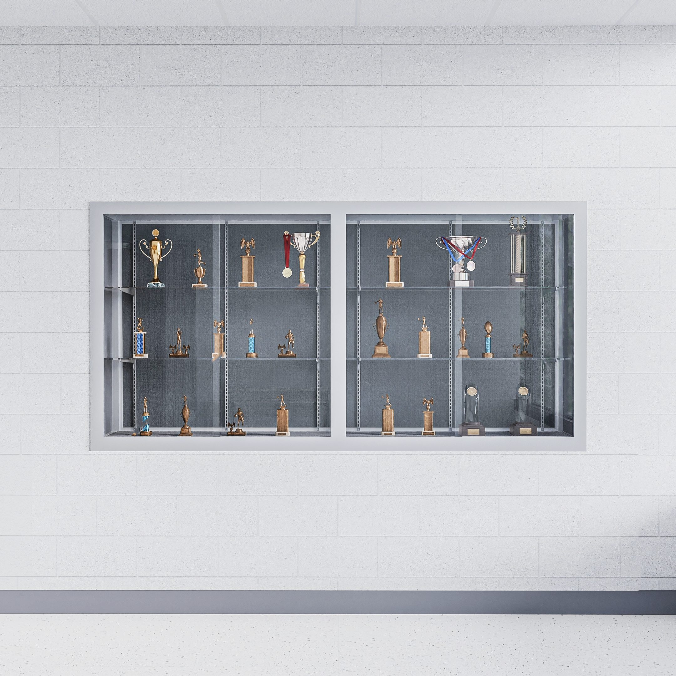
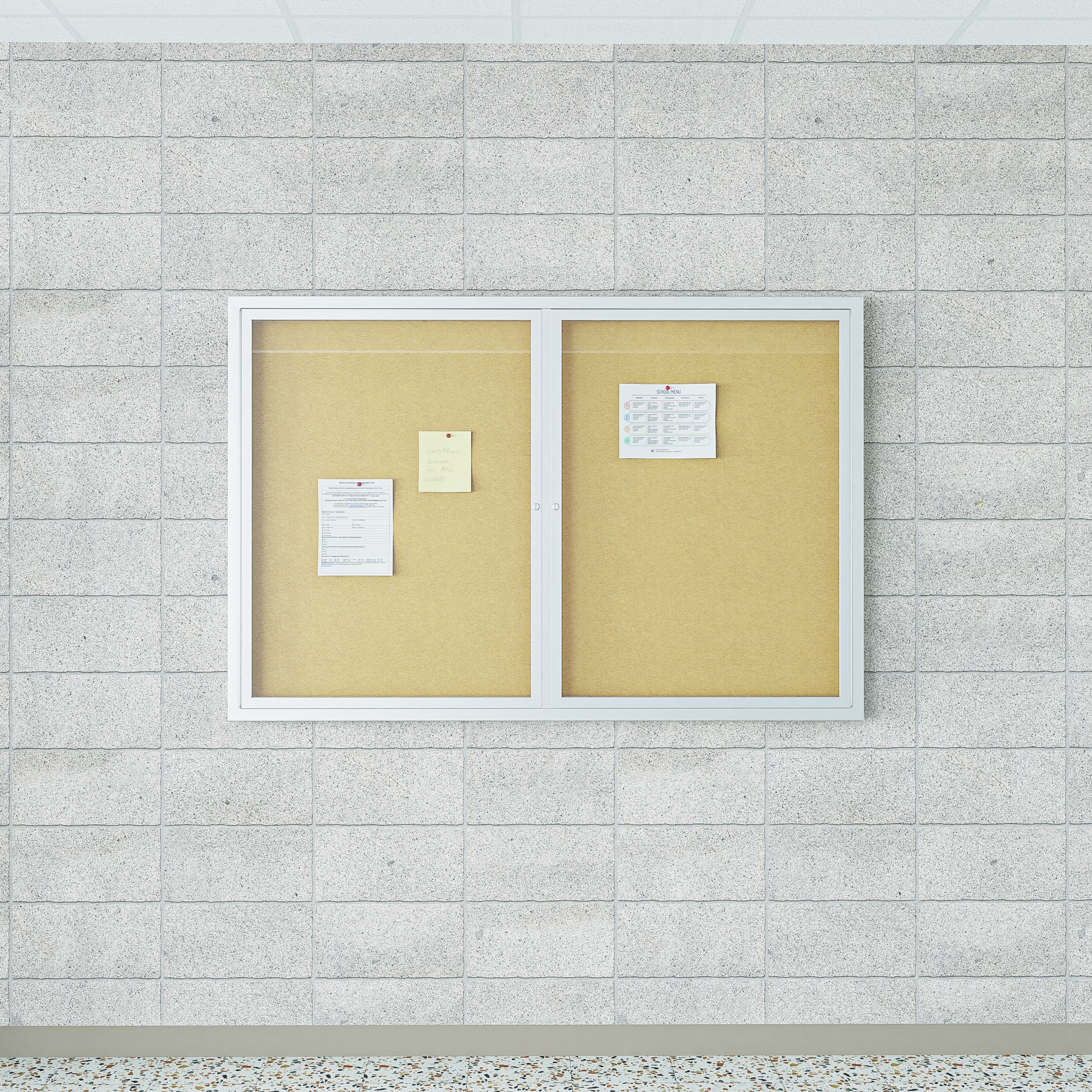
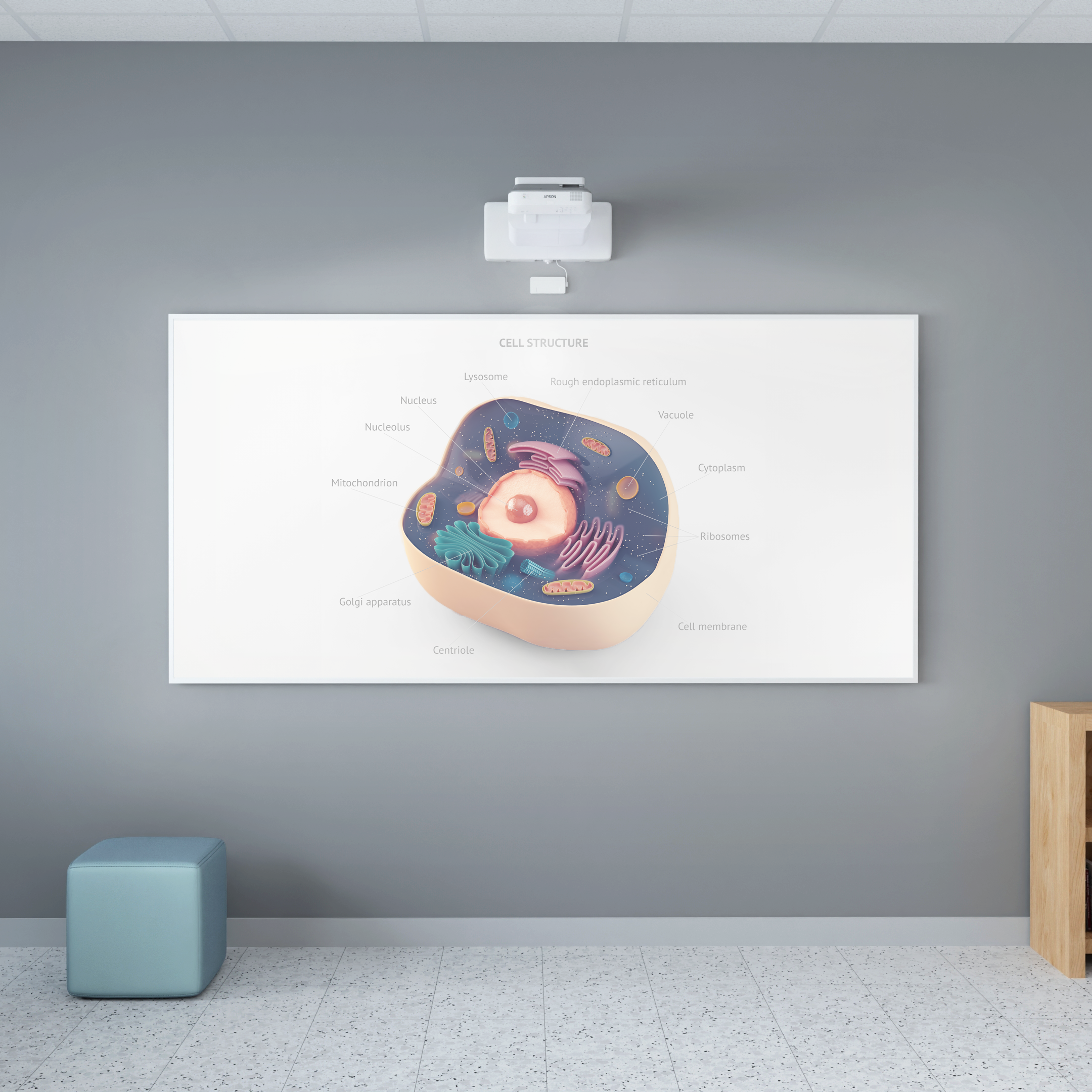
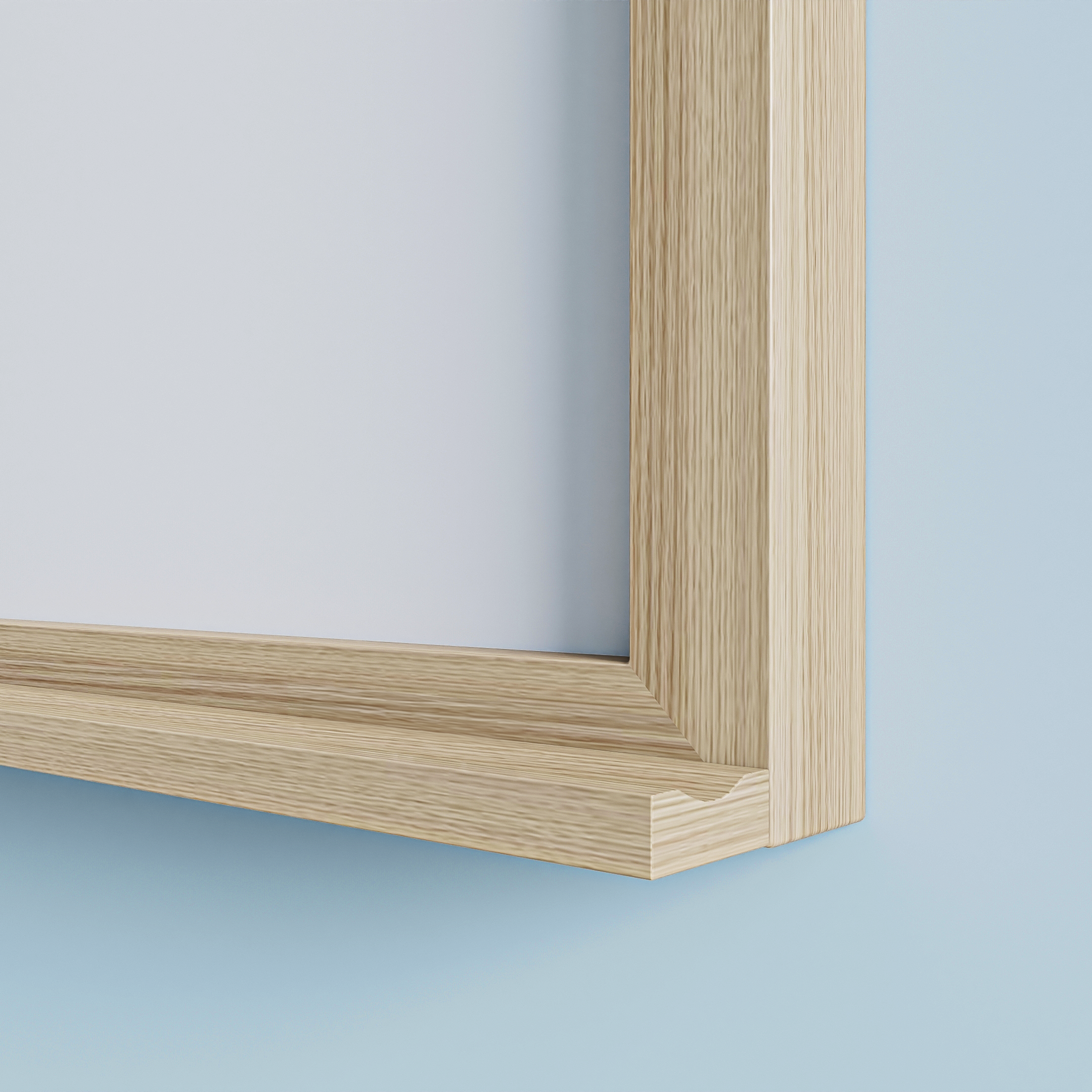
Approximately 90% of the website’s product imagery was created or reworked as part of the refresh. Using imagine.io, Photoshop, and Illustrator, I produced 3D environments, composited product scenes, retouched photography, architectural illustrations, and detailed product graphics.
The new library allowed Claridge’s products to appear consistently across educational, commercial, and architectural settings while providing enough visual variety to distinguish individual collections.


Communicating the Technical Details
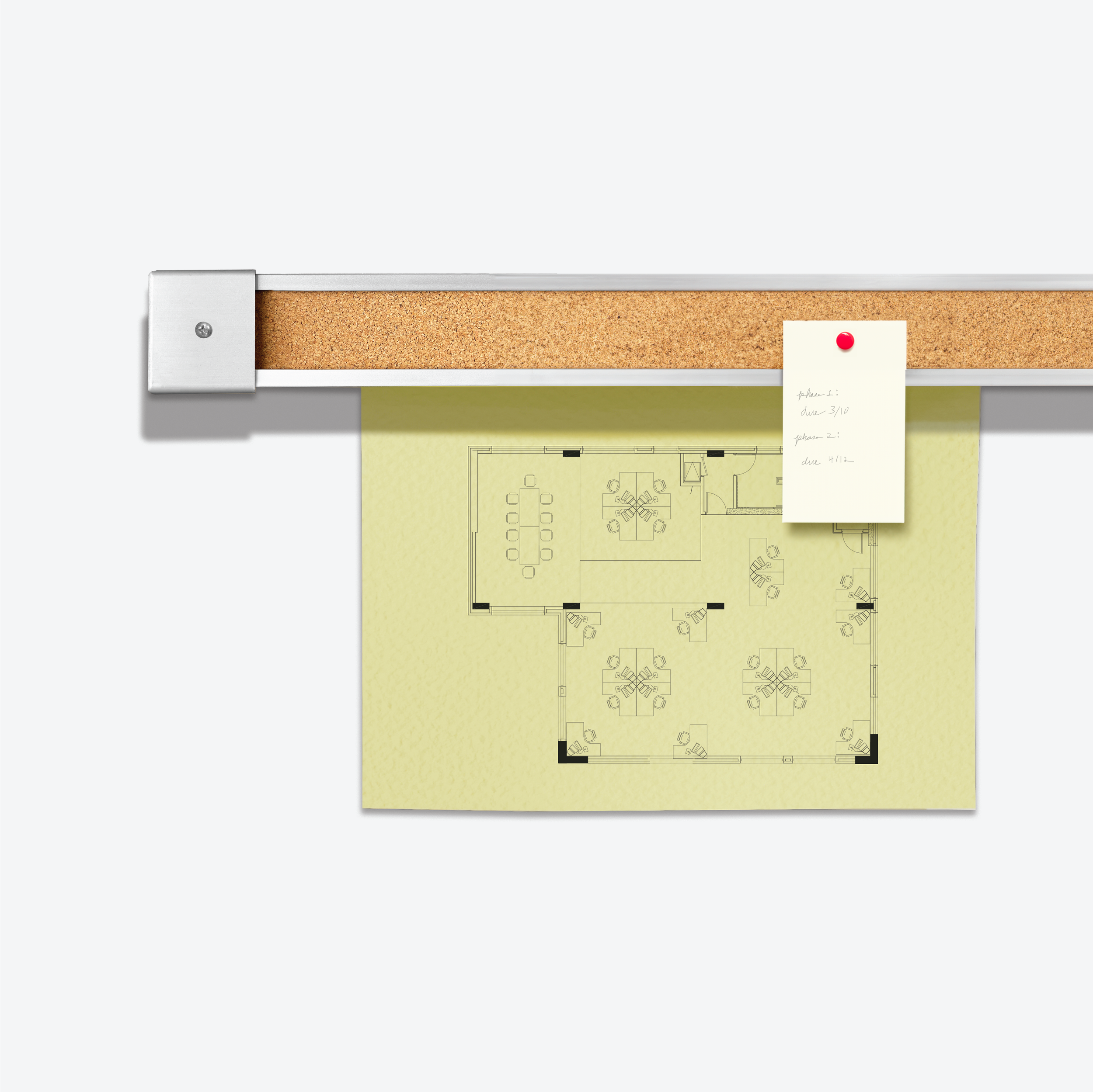
Beyond lifestyle imagery, the site needed to communicate the physical differences between products. I created a consistent set of graphics explaining frame styles, map rails, trays, and available dimensions.
These visuals translated technical product information into a format that could be understood quickly by specifiers, dealers, and school administrators.
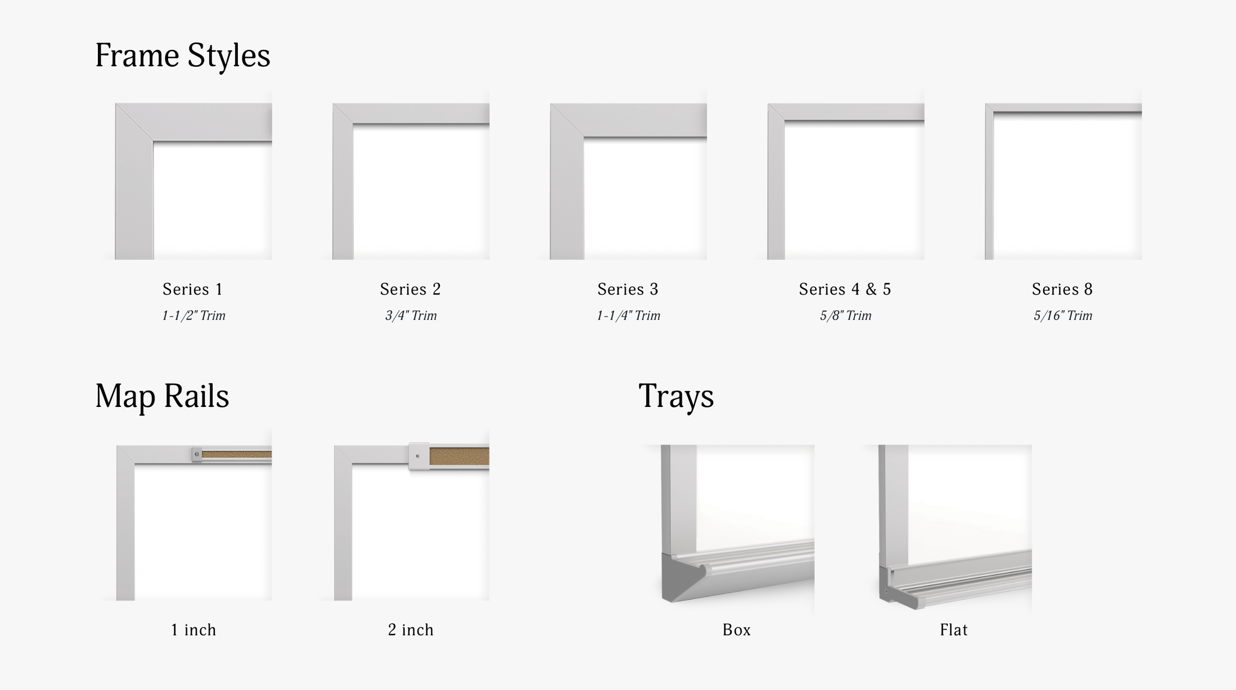
Standardized technical graphics made product construction and configuration options easier to scan and compare.
A System Built to Scale
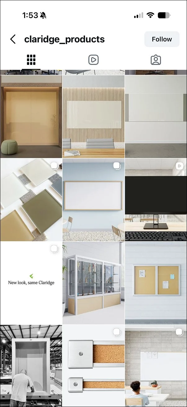
The refreshed identity launched in October 2023 and expanded beyond the website into catalogs, sales presentations, social media, signage, and other customer-facing communications.
Leadership and sales teams responded positively to the clearer distinction between Claridge and its sister brand, as well as the improved presentation of Claridge’s product families.

Outcome
The refresh gave Claridge a more focused identity, clearer product hierarchy, and a scalable visual foundation. It made complex product options easier to understand while retaining the recognition and heritage of the original Claridge mark. The system remains the foundation of Claridge’s visual identity today.